Brand Standards
Style Guide
Mary E. Patterson · 32 South Properties. A quiet, editorial identity for Charleston luxury real estate. Everything here favors restraint: generous white space, one accent color, one serif voice, and photography that carries the story.
01 — Brand Feel
Calm, editorial, personal.
Editorial, not salesy
Reads like a magazine spread. No badges, no urgency language, no exclamation points. Copy is written in Mary's voice — first person, warm, specific.
Restraint over decoration
Square corners (0 radius), hairline rules, no drop shadows or gradients beyond photo overlays. Movement is slow and minimal.
Photography leads
Images are the loudest element on any page. Type steps back so the home, the marsh, and the light do the selling.
Voice: do / don't
“A sampling of exceptional homes across the Charleston coast.”
“Don't miss these amazing hot deals!”
02 — Logos
Two marks, one lockup.
The Mary Patterson / Lowcountry Homes mark always leads and always links home. The 32 South Properties brokerage mark sits to its right with generous space between the two — they are neighbors, never merged.



Sizing
Mary's mark: 36px mobile / 44px desktop. Brokerage mark: 28px / 32px — always visibly smaller.
Clear space
Minimum 24px between the two marks, and at least the mark's own cap height on all sides.
Color use
Brass on paper backgrounds; solid white knockout over photography and ink. Never on a busy mid-tone crop.
03 — Color
Sand, slate, and one brass.
Paper
#F9F8F6
Primary background across all pages.
Sand
#EBE7E0
Alternating section background, quiet contrast.
Oyster
#D8CCB5
Text selection, soft accents, dividers.
Brass
#8C764D
The only true accent — eyebrows, buttons, underlines, wordmark.
Slate
#5B5852
Body copy on light backgrounds.
Stone
#756F65
Small caps, specs, metadata.
Ink
#1A1A1A
Headlines, dark sections, primary buttons.
Roughly 70% paper and sand, 20% ink and slate, 10% brass. Brass is a signal — if it appears more than twice in a viewport, remove one.
04 — Typography
Cormorant Garamond & Public Sans.
Display / H1
Cormorant Garamond Light · 48–72px · tight leading (1.05)
Charleston, South Carolina
Section Title / H2
Cormorant Garamond Light · 36–60px
Charleston, South Carolina
Subhead / H3
Cormorant Garamond Regular · 24–30px
Charleston, South Carolina
Eyebrow
Public Sans Semibold · 12px · 0.2em tracking · brass
Charleston, South Carolina
Body
Public Sans Regular · 18px desktop / 16px mobile · 1.65 leading
Charleston, South Carolina
Detail / Caption
Public Sans Regular · 12px · 0.16em tracking
Charleston, South Carolina
Headlines are always light weight and set tight; body copy stays comfortable at 1.65 leading. Small caps carry all metadata. Never bold a serif headline.
05 — Relative Sizing & Layout
Space is the design.
Page width
Content max 1320px, editorial text max ~720px. Gutters 20px mobile · 40px tablet · 64px desktop.
Section rhythm
96px vertical padding on mobile, 144px on desktop. Sections alternate paper / sand / ink.
Grids
12-column desktop; content typically 7 + 4 (asymmetric) or 3 equal cards. Card gaps 48px.
Ratio, headline to body
Headlines run 3–4× body size. If a headline looks small, it's probably right.
Corners & borders
Radius 0 everywhere. Borders are 1px at 10% black, or brass for emphasis underlines.
Touch targets
Minimum 44px height on every link and button, mobile first.
06 — Photography
Light, air, and place.


Architecture
Straight-on or slight three-quarter. Vertical lines true. Warm late-day light.

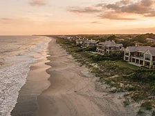
Coastal & landscape
Wide, calm horizons. Soft haze welcome. No saturated skies.


Interiors & detail
Uncluttered rooms, neutral styling, natural light only.
Treatment
Full color, unfiltered, slightly warm. Never black and white, never heavy vignettes or HDR. Crops are 4:3 for cards, 16:9 for video, full-bleed for heroes.
Text over image
Always a bottom-weighted dark gradient, never a flat scrim. Text sits low-left with generous margin. Portraits crop from the bottom so heads stay intact.